Thursday, December 9, 2010

Portfolio (First Semester)

I chose this picture because it is my "Thanksgiving" photo. I like the colors of it and I used the rule of thirds because the pie isn't centered. I like the focus on this picture because the other pies in the background are blurry and this puts emphasis on the first pie. This is the "Before" Sunprint photo. I chose Sillybanz because they showed different aspects about my personality. We had to put the paper in sunlight and put the objects on it and wait a while. When we though the paper had been exposed long enough we stopped the process by putting the paper under water. My banana barely came out because the bracelet was
clear. This is my "After" Sunprint picture. I used Photoshop to try different effects on the photo. I liked this activity because it showed me how Photoshop can transform a picture and make it look completely different than the original photograph.
This is my self-portrait and I chose it because it shows my personality. I dressed up in red because I wanted to show my class spirit because I am on student council. I had my mom take the picture at a low angle looking up at me, so that she could capture my whole body when I jumped up.

This is my photo for value. I chose it because it shows a variety of tones of grey, white, and black. I chose to take the picture of a spider-web because it looks simple and the black and white color emphaisis the web.


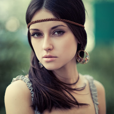
I chose this portrait because it shows the emotion: removed. I chose to emphasize her emotion by capturing the photo in black and white. It was hard to get the portraits because it was difficult to capture the emotions the right way.
This is the photo I used for my photo quiz rule of thirds part. I framed the rose by using the rule of thirds. I chose to capture it at a low angle, so that the flower looked huge. I like that the sunlight is behind the trees and that is almost looks like a back-light for the rose.
This is the photo I chose for my photo essay. It won photo of the day and I love it. My photo essay topic was about Mercy Week. This photo was taken during our Mercy Day Rally. I love this photo because Rachel is not centered, but she is main person in the picture. I chose to keep the picture in color beacuse I love that there is red everywhere because that's the senior class color.

This photo was from my Autobiography. The topic was favorite place, and I decided to take a picture of my keychain collection because it shows some of my favorite places. I took the picture almost dead-on, but I wish I had taken it at a more unique angle though.


Tuesday, November 30, 2010

Proportion

In class we had assignment about proportion. I was suppose to make something that is large look small. I succeeded in doing this by making Trea look really tall, and this makes the car look small. I created this shot by using rule of thirds and getting a low angle of Trea. Shooting the photo with a low angle helps to make Trea look taller. She looks much taller than the car, and the mansion building. Since she is so tall, she makes the car look small. This is how the photograph is successful.

Monday, November 29, 2010

Thanksgiving

During my Thankgiving break I was told to take food photography pictures. I took a variety of pictures of the different things I was eating. The first shot of the apple pie shows texture. I took a picture of what was on my plate, and used the rule of thirds when shooting it. The third photo is of tomatos, and I showed emphasis by taking a close-up picture of them. I was able to show the texture with the shot of the brownies because I took the picture up close, but wide enoough where there are more than one brownies in the shot. The dessert shot shows emphasis because of the color of the lemon bar. The yellow pops compared to the brown desserts that surround it.


Sunday, November 28, 2010

Baraka

So I spent two days of photography class watching a silent film. I am assigned to write a blog post about my thoughts about the movie, and it must be at least 2-4 paragraphs. This movie will definitely not make my "Favorite Movies" list. It was extremely hard for me to focus on the movie, because it was mostly silent. The movie got my attention during the chanting scenes because the sounds were intriguing. It took a lot of effort to focus, but I did it.
Once I was able to focus on the movie I realized that it reminded me of National Geographic. It seemed like someone could pause the movie at any point in time, take a picture of the still frame and put it in National Geographic Magazine. In my opinion the movie was pictures out of the magazine with movement added to them. The movie showed different places in the worlds and allowed us to see a little bit of the culture from that world. I love traveling, and so I was interested in all the different places the movie took us to see. I loved the tribal shots becasue it showed people who are like us living on the same planet as us, but living a totally differnet lifestyle. It's cool to see that because it is completely different compared to the life we live. I have always wanted to go to Africa and see how the people live like this, and immerse myslef in their culture.
I studied the movie for the differnet photographic elements it used. They used everything from rule of thirds to emphasis to color. The use of these elements reinforced the thought in my head that the movie looked like different photographs put together to form a movie. Any still fram of that movie would have created a beautiful photograph I think. I wouldn't be able to watch the movie again because I feel like my mind would wander off too much, but I am happy that I did watch it once. I was shown a differnet type of movie than I am used to. Since I want to become a filmmaker I studied the shots of the film and anaylized it that way too. I gained a lot from the movie by seeing the photographic elements in a movie, and learned about the different ways people live.

Wednesday, November 17, 2010

Dear Rebecca,

Dear Rebecca,
I enjoyed the three sentence letter. I don't really know how to respond to that letter, I mean there was soooo much in the letter. :) Well, I do love Austria and I think we should go together sometime! I am glad you noticed the elements and principles in my photography album on Facebook.
Sincerely,
Irene

Shadows

For this assignment we had to go to take pictures of shadows. It was extremely hard to get shadows because we are zero-period and there weren't that many. I had to hunt the shadows down and then decide how to shoot them. I choose this photo for photo of the day because I liked how the shadows appeared through the windows. I choose black and white for this photograph to put emphasis on the shadows and light. If I had used color the surrounding colors could have distracted the person looking at my photo from focusing on the shadows.

Monday, November 15, 2010

Dear Chelby...

Dear Chelby,
I loved seeing the pictures from your summer! Sometimes there were pictures that used rule of thirds, lines, or emphasis, but I don't think they were taken like that. Usually we just take pictures for the fun or it, like snapshots, we don't set up the picture before taking it. The pictures are taken in the moment. I now know how much you love to go to Hawaii during vacations! The pictures of you with your family and friends were great and showed me how important those people are to you. I really liked the picture of you and your mom; it was really cute! I would love to see more pictures that use the elements and principles. I would suggest taking some pictures in black and white for close-ups, just to see how they look different than color photos. Good luck with your future pictures!
-Irene B :)

Thursday, November 11, 2010

One Shot

So for this exercise we took as many pictures as we wanted, but were only allowed to upload one. It was difficult for me to choose one picture out of all the ones I took. I had to rely on what I saw from the screen, and wasn't able to compare pictures on the computer to see which one was the best. I choose this picture because it uses the rule of thirds, and it is cool to see the reflection of the trees in the fountain. The bright color of the flowers emphasizes it in the photo, and that is why I choose to take the photo in color. This exercise helped me improve my skills of narrowing down my photos to pick the best shot.

Wednesday, November 10, 2010

Sports Photography

So we had to take pictures of practice and a game for volleyball. The first picture was one of my better ones from practice. It was frustrating because during the practice I was still trying to figure out what settings to have my camera on to make the shot less blurry. For me sometimes the wide shots were less blurry than the close-ups. I liked that the hands in this shot were blurry as they are about to hit the ball, because it shows movement. The second shot was not an action one, but a shot to show emotion. That is why I choose black and white because it emphasizes the athletes' faces, not the surroundings. I like the smiling expressions everyone has and how they are in a group hug. The last photo is an action shot during a game. The hand is still blurry, but the rest of the photo is well lit and not blurry. The focus is on the girl hitting the ball because everyone is looking at her. I like the players' expressions, especially Katie's, and how everyone is waiting to see where the ball will land on the opposite side.

Wednesday, November 3, 2010

American Photography (Movie Notes)

-pictures are most important possesion for some people
-keep photos for emotional reasons, record an accomplishment, or show other parts of the world
-Brownie camera: in production for 80 years
-cheap price, anyone could own it
-Luc Sante: postcard photos
-send postcards to other people to show them what's happening in their life
-some were exaggerated photos
-coverage of huge events
-half-tone: allowed photos to be printed multiple times
-National Geographic: printed color photographs
-people would form opinions from photos
-Edgar Curtis: took pictures to document the people who were "disappearing"
-manipulated photos to make people seem happy
-choose what Indians wore, if not right look
-snapshot camera created: anyone could take a picture, not a form of art yet
-would make photos look like art by scratching the negative image, or use brushstrokes to
put chemicals on the images
-made it look like a painting
-handmade process allowed photos to be seen as art
-Frank Gillbrith: photographed every motion of a worker
-helped to eliminate pointless steps in production
-Lewis Eyne: used photos for educational purposes
-used for social change
-Paul Strand: straight photography
-took pictures without manipulating them
-emphasized framing and subject
-War photos
-Wilson used propoganda to raise support for WWI
-no photos of dead American soldiers allowed
-Anti-War party published photographs of dead American soldiers, showed people the
truth
-Daily News: first newspaper to build itself on showing photographs
-composer graph: take a photo and paste a different face on it

Monday, October 25, 2010

Journal Notes Pg. 114-119

The first portrait is a candid one. This shows the boy doing a fun activity, playing in the water. The boy is not posing, but is still the main focus of the photo. The photo captures the boy being natural. A good photographer takes good candid photos by going unnoticed by the subject. The photographer achieves this because the boy does not notice his picture being taken. The surroundings in the photo help add to the picture and the setting of the subject. The second portrait is a formal one. It is a simple photograph, and the emphasis is on the subject, not the surroundings of the photo. The background is neutral and puts the focus on the subject.

http://www.portrait-photos.org/photo/20473.html
http://www.portrait-photos.org/photo/24098.html

Tuesday, October 19, 2010

Journal Notes Pg. 140-149

I choose this action shot because it shows movement. Besides making the background blurry, another way to show movement is by making the subject blurry. This is called subject motion blur. The photographer used a low shutter speed to obtain this photo. Because the subject is blurred you know that the photographer did not pan when taking the photo. If he had panned during the photo the subject would most likely not be blurred. I like that the subject is blurred, but not too blurred. I am still able to tell what the subject is even though he is blurred.

http://inlinethumb57.webshots.com/42232/2885597010089500921S425x425Q85.jpg

Monday, October 18, 2010

Journal Notes Pg. 130-139

I choose this picture to show action photography. The photographer was conscious of the background and made sure that the emphasis is on the biker. He achieved this by making the background blurry and having the focus on the biker. He created movement by having the background out of focus. It's a good action shot because it shows the subject in motion. http://www.mid-brain.com/photo/img/GMBR-bike.jpg

Sunday, October 17, 2010

Five Pictures

These are the five pictures I took over the weekend. I used different filters when taking my pictures. For my first picture I used a color accent filter, which shows specific colors and the rest of the picture is black and white. I used it to make the photo more fun and engaging. The red and orange colors are bright making the photo fun. The second picture I took was at a concert. I took the picture of Auburn and center-punched her because I wanted the emphasis to be on her. That was another reason I framed the picture, so that the background was mostly black, so the focus was on her. The next photo I took in black and white because it shows the different values from the flower and leaves. I framed it so that the flower took up most of the frame because the flower is emphasized in the photo. The fourth picture I took was of a cup of Sharpies, but they were lying down. I framed it using the rule of thirds. I like the angle I shot the photo with because it is unique for the object I am photographing. The last photo was at a concert. Jason Derulo is center-punched here too for emphasis. I choose black and white because it conveys the emotion from the crowd better. I like that I captured the hands of the crowd at the bottom of the photo too.


Wednesday, October 13, 2010

Portrait- School

I choose this picture for the "Who you are at school." I had my mom take the picture at an angle. She was sitting on the floor and was tilting the camera up. I decided to jump up and be excited to show my enthusiasm for my school. I dressed up in my senior colors to show my spirit. I am on student council and I represent my grade, which is another reason I wore red and my senior class shirt. I am not at school in this picture, but I am wearing clothes that represents my grade and my school.

Wednesday, October 6, 2010

Journal Notes- 108-113

I learned more about formal portraits during my reading. The emphasis should be on the subject and this can be created by putting them in the center of the image. The photographer put this man in the middle of the image to show emphasis on him and had a neutral background behind him, so that the focus was on the man. The photo is good in color because the background is an earth-tone, and contrasts from the clothes the man is wearing. www.orbitexperience.com/biography/portraits/medium_formal_portrait.jpg

Tuesday, October 5, 2010

Journal Notes- 103-107

I got my photo examples from http://www.portrait-photos.org. This website had many portraits and of all types. I love the first one with the woman looking out the window. They framed her using the rule of thirds, but there is not a lot of background in the shot to distract the viewer from the emphasis of the subject. The second photo is the one in color. The subject is in focus and the background is not. This allows the viewer to concentrate on the subject. The subject is framed using the rule of thirds, but this photo is in color. I think the color makes the picture look more candid. It helps establish the subject's personality because we are able to see the colors of her clothing and what people around her are wearing. The last photo I choose because it shows the different values the photographer can show in one photo. One side of the subject's body is in light, but the other half is covered by shadows. The usage of black and white helped show this more because it helps the viewer see the light and dark regions in the photo.

Monday, October 4, 2010

Journey Through Spirit (Photo Essay)

The first photo I took in black and white because I felt that it had more of an impact because people aren’t able to differentiate the people in the photo. It looks as if there are hundreds of people on the steps. If I had put it in color it would not have looked as unified because there would be different class colors in it. I framed the picture with the help of the school and I like how it looks symmetrical around the students. The second photo was one I took for fun, but when I was going through my pictures it struck me. It is easy to make a picture in a mirror, but the angle I did it is very unusual. I framed the shot so the car mirror is the frame. There is some background, but that is all out of focus putting the emphasis on the Rebecca and me in the mirror. I was able to capture Rebecca with her ears and my ears. It shows our costumes for Disney-Day. The picture of Avery is taken vertically because I wanted to get a medium-close up shot and not have a lot of background space. I choose black and white because I wanted her face to be emphasized not the outfit she was wearing and showing the colors of the outfit would have ruined that. After Avery’s photo I have another one of everyone dancing at the rally. I took it in black and white because it makes everyone seen unified and makes more of an impact. It seems like there are more people there than there were. I framed Celine using the rule of thirds and I made sure to get the “Super Heroes” in the shot. I showed color in this photo because the words on her forehead are written in red and that is the senior class color. I took the picture of Alex in black and white because I wanted the flag to be emphasized. She was wearing red and blue and had the picture been in color there would have been too many colors that would not emphasize the logo on the flag, because too many colors are distracting the viewer. I love the picture of Rachel because of her expression. She is in focus, but the people behind her are not and it helps show emphasize on Rachel. I framed the last picture of Alex and the other seniors using the rule of thirds. I took it in color because the red pops against the green surroundings. I wanted the color to pop to show the seniors’ color and it shows emphasis on them.


Wednesday, September 29, 2010

Career Paths- Sports Photography

Veronica Smart told our group about sports photography. I lerarned that if I was a sports photographer I would...
-have to get up-close to the action
-try to get a Press Pass or get near the sidelines
-need to know that it's competitive because other photographers are there too
-have to try to focus because there are many distractions and there are a lot of people at sports events
-need to know the sport, so I could capture "the moment"
-know that sports photography is all about timing
-focus my picture on the subject, and isolate my subject so that there aren't a lot of distractions in the background
-make sure that I see the subjects face, to see their facial expression
-take the photos vertically if it were a shot of a single person because they will look taller and the focus will be on them
-take photos horizontally if it were a picture of a group of people playing and I wanted to see everyone
-use the rule of thirds to frame my subjects
I learned many things today about sports photography, and it seems like an interesting career path. The photo below is an example of sports photography and is a great example of an action shot. The emphasis is on the snowbaorder and he is framed using the rule of thirds. I believe the photographer used a large shuter speed to capture this shot. I like that the snow near the snowboarder is in focus, but the snow toward the edges of the photo is blurred.

https://www.vistek.ca/buyingguides/cameralenses/images/snowboard1.jpg

Tuesday, September 28, 2010

Lauren Greenfield

Lauren Greenfield is photographer for photojournalism. She has been named one of the most influential photographers of 2003. Her work is in major museums across the country. She is known for her photography of youth culture. She graduated from Harvard and interned at National Geographic. She photographs have been published in the New York Times, Vanity Fair, and Marie Claire just to name a couple. She made a documentary called "Thin," and she made a photography book about it too. She made a short film called "Kids + Money," and it was after this film that she started to win a lot of awards for her films and photography. She has done fashion photography, and all different types of photojournalism.

http://www.laurengreenfield.com/index.php?p=O56IYEGG