Monday, May 2, 2011

PSA Campaign

In 1863 a man named Henry Bergh went to Russia for work and saw how they treated work animals. He came back to New York and by 1866 he had founded the American Society for Prevention of Cruelty of Animals. In 1894, the society created animal shelters and promoted the practice of animal rescue in New York City. In 2009 there were about 3,500 animals shelters throughout the United States, and over the years the number has continued to grow. Millions of animals enter these shelters every year. Only 2% of cats and only 17% of dogs are returned to their owners. Owned animals live longer and healthier lives than strays or animals in shelters. The only thing these animals want is a family that will love them. Go save an animal today by adopting one from an animal shelter! You can go to www.peninsulahumanesociety.org or call (650) 340-7022 today to learn more about adopting an animal.


Sunday, March 20, 2011

Andy Warhol Photography

Andy Warhol
· Real name is Andrew Warhola (8/6/28-2/22/87) (Became Warhol after a misprint)
o Born in Pittsburgh, PA, Parents from Czechoslovakia (does not exist anymore)
o Father worked in a coal mine
· In High School, kicked out of art club because he was “too good”
· Graduated from the Carnegie Institute of Technology (Bachelor of Fine Arts)
· Graduated with degree for pictorial design & wanted to become a commercial illustrator
· Designed advertisements for women’s shoes
· Used Polaroid camera
· Fear of hospitals and doctors, hypochondriac
· Favorite print making technique was silk screening
· Friends & family described him as a workaholic
· His sexuality was speculated upon and how this influenced his relationship to art is “a major subject of scholarship on the artist”
· First solo expedition in 1952
· Coined the term “15 minutes of fame”
· 1960s: iconic American products (pop art)
· Created The Factory, his NYC studio from 1962-1968
· Celebrity portraits developed into one of the most important aspects of his career
· Made films (first one called Sleep – 6 hours of a man sleeping) (1963)
· 1965 said he was retiring from painting
o 1972 returned to painting
· Designed cover for the Rolling Stones’ album Sticky Fingers (cover made out of real jean material)
· Produced Velvet Underground’s first album
· Started a magazine called Interview, worked for Glamour Magazine, Vogue
· Shot by Valerie Solanas 3 times for being abusive and “too controlling” (6/3/68)
o Solanas authored the S.C.U.M. Manifesto, a separatist feminist document
o "Before I was shot, I always thought that I was more half-there than all-there – I always suspected that I was watching TV instead of living life. People sometimes say that the way things happen in movies is unreal, but actually it's the way things happen in life that's unreal. The movies make emotions look so strong and real, whereas when things really do happen to you, it's like watching television – you don't feel anything. Right when I was being shot and ever since, I knew that I was watching television. The channels switch, but it's all television."
· Marilyn Monroe = favorite model (not painted until after death)
· Wore silver wigs until he dyed his hair silver
· Practicing Ruthenian Rite Catholic who described himself as a religious person
· Died of a heart attack brought on by a gall bladder surgery and water intoxication
· $100,000,000 for one of his paintings (highest amount paid) (“Eight Elvises”)
· Referred to as the “Prince of Pop”

Portrait: Mom
4-Square: Canned Vegetables
Pop Object: Juice Squeeze

Sunday, March 13, 2011

Photoshop Explanations

I blended two images together to create this picture. I picked two images and made sure they were the same size. I chose the picture with the piano as my target image. That means it's the background images, the main one. I made a duplicate layer of the background layer. I then went to image and apply. Once the picture had been applied to the other picture with the piano I changed the opacity. I made the opacity around 70%. The difference between this picture and the other blended image was that I used a gradient map on the flower image before blending it with the piano. I chose an orange gradient and made it darken across the flower.
In the beginning, I used the magnetic lasso tool to copy and paste my dog on a new layer. I did the threshold process on the picture of just my dog. I made a duplicate background layer and made ten layers of it. I used threshold on each layer and started with the top layer showing only a little black and ending with the bottom layer, which was completely black. Starting on the top layer and working my way down, I used the magic wand tool to delete all the white in the picture. After deleting the white on that layer, I made sure all the pixels were highlighted and I would pick the color I wanted the black to become and clicked control and backspace at the same time. I did this for each layer working my way down to the bottom layer; the only difference for each layer was the color I chose. The top layer has the darkest color and the bottom layer has lightest color. Also, I made the duplicate background layer black and white and put a filter on it. I used the glass filter I think. I changed the settings of it until I was happy with it.The way I created this picture was by copying Alex and pasting her onto the other picture. First, I made a duplicate layer of the background layer. Second, I desaturated the image of the road and I put a artistic filter on it. I believe it is the colored pencils one, but I changed the amount of lines and darkness until I liked it. Third, I used the magnetic lasso tool to select Alex. Then I copied and pasted her onto the other image to get this picture.
I blended two images together to create this picture. I picked two images and made sure they were the same size. I chose the picture with all the seniors in it as my target image. That means it's the background images, the main one. I made a duplicate layer of the background layer. I then went to image and apply. Once the picture had been applied to the other picture with all the seniors I changed the opacity. I made the opacity around 60%, so that the top image of Rachel looked faded.I used a fisheye effect on this picture. I took a picture of flowers and then made a duplicate of the background layer. I used the elleptical marquee tool to select a part of the picture. If you hold down the shift key you can get a perfect circle. Once I have the circle around the portion I want, I go to select inverse and then hit delete. Now the image is just in the fisheye lens. I reverse my selection, so that the whole selection back in the fisheye lens. I crop the picture so it's only of the fisheye lens. I go to the filters and select the spherize filter under distort. I can change how much I want to distort it, and after I click ok the picture looks like it was taken with a fisheye lens.

Final Photoshop

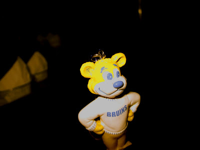
Our assignment was to create a picture using the skills we learned using Photoshop. In the beginning, I used the magnetic lasso tool to copy and paste my keychain on a new layer. I did the threshold process on the picture of just my keychain. I made a duplicate background layer and made ten layers of it. I used threshold on each layer and started with the top layer showing only a little black and ending with the bottom layer, which was completely black. Starting on the top layer and working my way down, I used the magic wand tool to delete all the white in the picture. After deleting the white on that layer, I made sure all the pixels were highlighted and I would pick the color I wanted the black to become and clicked control and backspace at the same time. I did this for each layer working my way down to the bottom layer; the only difference for each layer was the color I chose. The top layer has the darkest color and the bottom layer has lightest color.

After the threshold, I decided I wanted to use one of my landscape photos as the background for my keychain threshold picture. I had to check the image sizes for both picture and make sure they matched before I could combine the pictures. I made the keychain photo the same size as the landscape photo. After that I used the marquee selection tool to select the whole landscape picture. I copied the selection and pasted it onto the keychain photo. I put the landscape layer underneath all the other threshold layers, and this made it look like the background of the keychain picture.

I wanted the landscape picture to look different, so I used a gradient map on the landscape picture layer. I chose a gradient that had pink in it. I put that on the picture of the landscape. After that I chose an artistic filter for the landscape layer too. I picked the neon filter. Lastly, I selected a photo filter to put on the landscape picture, even thought it had the gradient map. The cooling filter 82 is the filter I picked. This is why the background has pink and blue in it.

Thursday, February 24, 2011

Little Toy

Our assignment was to take pictures of a little toy during the 5-day break. I decdied to take pictures of my UCLA Bruins keychain (UCLA > USC) and I brought it around with me. Thursday I was at home, so I took a picture of the keychain at the windows in my hallway. Friday I knew to Los Angeles, and on the plane I did my government homework. I used photoshop to make the picture blue and yellow with a gradient filter. Saturday I was in Santa Monica and decided to take a picture of my toy with the beach and palm trees in the background. Sunday I was on a party bus, and I like that most of the picture is black because I think it creates a mysterious atmosphere. Monday I flew back to SFO and I took a picture of my toy next to the airplane window.

Wednesday, February 16, 2011

Fantasy Photoshop

The first picture is made by coping and pasting another picture onto the landscape picture. The second two pictures are made by blending two pictures together. I choose to make the background black and white for the copy and paste image because it puts more emphasis on Alex. I put a flower on the piano, but I like that the opacitiy isn't 100% so that it looks like it's slightly there. I lovelovelove the blended image of Rachel and the seniors at the Welcome Rally. I choose those two picture because they go together and the effect of blending them looks really good. I loved the two blended pictuers because they look like ghosts. I enjoyed making the blended pictures more than the copy and paste images.


Thursday, February 3, 2011

Fish eye

We did the fish eye effect in photo shop. I liked how it makes the pictures looks like snowglobes. The peoples' faces looks a little distorted, but the picture still looks nice. The same thing happened to the flower, but the fish eye effect still looks good on this image.


Wednesday, February 2, 2011

Landscape Pictures

The Big Shot was taken at Heritage Park in Burlingame.
This photo is the edited version of the Big Shot.
This detail shot was taken at the San Mateo Japanese Garden in Central Park.
This abstract picture was taken of the creek in my friend's backward.

Monday, January 24, 2011

Architecture Project

Location One: Big Picture (Oracle Buildings, Redwood City) Location Two: Details (Guest House, Hillsborough) Location Three: Big Pictue (Gilead Sciences, Foster City) Location Three: Details (Gilead Sciences, Foster City)
Location Three: Interior (Gilead Sciences, Foster City)

Thursday, January 20, 2011

Chapter 9 Blog Notes

Carleton Watkins wanted to capture the American West. In 1854 we worked for a Californian photographer. 1858 was when we opened his own gallery. By 1861 he was photographing in Yosemite Valley. His photographs were the first to be made art. Ansel Adams was inspires by Yosemite Valley too. He made his best-known images at Yosemite. His landscape photography tried to capture the experience of wilderness. Below is a picture taken by Carelton in Yosemite. The picture is in focus, and has good clarity. The viewer is able to see the lines on the rocks and the bristles of the trees. He uses value in thispicture by shooting it in black and white. This helps to emphasize the texture in the picture.
http://carletonwatkins.org/Gallery/gimg/gimg_w0020_d.htm

Timothy O'Sullivan was sent to photography the Civil War. His images are similar to ones of modern-day documentary photographs. He was the principle photographer
for Alexander Gardner's famous book "Photographic Sketchbook of the War." After the Civil War, O'Sullivan became the lead photographer on the first U.S. government photographic survey of the western lands. His photographs were straightforward photographs of landscapes. Composition is one of the most important aspects for landscape photography. Photographers must pay attention to the placement of the camera, but they should explore all the options. For black-and-white photographs value is extremely important. They are more dramatic when there is a range of value in the picture. The tones can help set the mood in the photograph. There should be a balance between unity and variety because it creates interesting art. Landscape photography has been characterized by maximum depth of field. The photographer should use a f/16-f/32 f-stop. The smaller f-stop allows for a longer shutter speed, which means a tripod is necessary. Just after sunrise and just before sunset is the two times during the day when many photographers take pictures. The objects and textures are emphasized by the side lighting. Direct sunlight creates highlights and shadows that make the landscape look three-dimensional, but for closer shots the direct sunlight creates highlights and shadows that have no detail. Use 100 ISO film with a 35 mm camera to capture all the details. Using black-and-white for the photos emphasizes value, line, shape, texture, and pattern. Sometimes color photos can be overpowering too. Wide-angle lens are preferred for landscape pictures. Telephoto lenses are used for photographs that concentrate Check Spellingon details. Macro lenses are used for really up-close images. The yellow filter will bring out the clouds and many photographers use it. Pairing a red filter with a polarizer will darken the sky, and allows the image to look more dramatic. Grand landscapes include a large expanse of the scene and wide-angle lenses allow photographers to get that picture. The horizon should be placed using the rule of thirds. Details and close-ups are more inviting and comforting. Many photographers prefer to shoot in cloudy weather because the light is even and it eliminates harsh shadows. With lighter values, the photographer needs to open the f-stop or slow down the shutter speed and opposite for darker values. Abstracted elements are those that consist of lines, shapes, values, and textures. It is best to create an abstract picture by getting really close to your subject and photograph only a small bit. The image below shows a detail picture. The second row of stairs is the emphasis in the picture because that's where the focus is. There are lines and pattern in this picture from the stairway.
http://www.akotlik.com/blog/wp-content/uploads/2010/07/s_arc_0212.jpg

Tuesday, January 18, 2011

Landscape Photographer Bio: Ansel Adams

Ansel Adams was born Feb. 20, 1902 and died April 22, 1984. He was born in San Francisco, California. He broke his nose when he was four because of the aftershock of the 1906 Earthquake. He was the grandson of a wealthy timber baron, but the family fortune collapsed in 1907. He was an only child. He had problems fitting in at school and was possibly diagnosed as hyperactive. He could have suffered from dyslexia too. His father and aunt ended up tutoring him. Because of the solidarity of his childhood Adams found joy in nature. He went hiking a lot to see different parts of nature. He taught himself how to play piano and read music when he was twelve. Piano was something that brought him substance, discipline, and structure to his life. He played piano for many years, but gave it up for photography. He loved shooting Yosemite National Park. He used the Kodak Brownies camera his parents had given him and went on hikes in Yosemite while taking pictures. In 1919, he joined the Sierra Club and spent the next four summers at Yosemite. He met his wife, Virginia Best, in Yosemite and they were married in 1928. The couple had two children. In 1922 Adam's published photographs and writings in the club's Bulletin. In 1928, he had his first one man exhibition in San Francisco. His first visualized photography was the Face of Half Dome. He met Albery M. Bender who helped set in motion the publication of Adams' first portfolio. Adams' friendship with Bender changed Adams' life. He had now had the confidence to pursue his dreams. His work was published with the help of Mary Austin in 1930. It was called Taos Pueblo. His first important one-man show was held in SF at the M. H. de Young Memorial Museu, in 1932. He opened the Ansel Adams Gallery for the Arts. During the 1930s, Adams started publications about methods of photography. Alfred Stieglitz gave Adams a one man show in his New York gallery in 1936. He was the second time Adams' work had been exhibited. In 1937 Adams met Paul Strand. Strand encouraged Adams do straight photography, which is clearer expression of subjects. He preferred small apertures and long exposures. Adams believed that the finished product must be thought up beforehand, and then be executed. He was the first photographer to take a portrait of a President. Although Adams loved to shot in black-and-white, color pictures of his do exist. Adams died on April 22, 1984.

Below is the photography White Branches, Mono Lake. Using black-and-white, Adams is able to show the value in the picture. The picture looks more dramatic with the variety of tones. Lines are shown in this picture because of the tree branch. The branches form lines that lead into the one branch, or the one branch becomes many branches and lines are formed coming away from the one branch. Adams uses the rule of thirds because the branch is not centered horizontally or vertically. There is unity and variety in the photograph too. There is unity among the dark rocks that are covered with shadows, but there is variety between the rocks and the tree branch. The light color of the branch against the dark value of the rocks helps to emphasis the branch.
http://www.anseladams.com/White_Branches_Mono_Lake_p/1701211102.htm

Orchard, Early Spring
http://www.anseladams.com/Orchard_Early_Spring_p/1701145103.htm

Yosemite Falls, Yosemite National Park
http://www.time.com/time/photogallery/0,29307,1932762_1974604,00.html

Thursday, January 13, 2011

Blog Notes

Early films are slow and took hours to develop. It was easier to take pictures of buildings because they are not moving. Fredrick Evans is one of the greatest architectural photographers in history. He captured the emotion of the place he was taking picture of. Line in the picture can help divide your photograph into differnet sections so that the viewer can see the differnet values and textures. Depending on how you take a picture of the building it can share a story. Photographing the building and the things around it can show more about its personality. Pattern is a part of each image in architectural photos. They can make the pictures stronger and add to the visual complexity. To have more of the scene in focus the photographer should have a small f-stop because it gives them a greater depth of field. For 35mm cameras this would be f/11-f/22. For detailed pictures use a bigger camera using f/32-f.64. The more value illustrated in the picture the more three-dimensional the picture looks. Contrast and texture add to the picture. Architectural photographs are divided into two types, commercial or artistic. Commercial pictures are for brochures or magazines and are usually in color. Artisitic photographs are usually in black and white. Black and white emphasizes value, shape, and texture. Color emphasizes color and the setting. For interior architecture photography color lighting is very important. For inside the buildings there are a variety of types of lighting that can be used. Incandescent lights (household bulbs), cent lights (modern spotlights), and flourescent lights are used to produce white light. A deep blue 80A filter can help correct photographs when they come out orange. Don't use more than one type of light source because you can only filter one for each photograph. There are three different types of architectural photographs: big view, detail, and interior view. Every building has a pattern, but to take artistic photos the photographer must figure out how to capture the building to show its personality. The architectural photos can be in black & white or color. For interior design lighting is very important. Using filters can help change the light for the picture. A greater depth of field is required for interior architecture because then everything is in focus. For interiors you will be close to the elements 4-20 feet away and have an f-stop between f/11-f/22. The closer to the element the more depth of field there will be. Put the camera on the tripod and have a slower film with a higher f-stop. For big view wide-angle lens is needed, and the photographer can exagerate the picture by taking it at a low angle looking upward. Remember that the wider the lens the more disorientation you get in the picture. Keep the camera and lens level as often as possible. Tripods help to balance the camera and make it easier to take pictures of the buildings. Monopods, which are single-legged cameras, work for walking arouund and shooting details. Unfortunately, they don't work for interior photographs. For interior photography you would need to be using long shutter speeds and need maximum support such as a tripod. Shadows on buildings or from them can create interesting photographs. The big view picture shows the overall architecture. Usually taken with a wide-angle lens or was taken further away. The farther from the building the photographer is the less disorientation there will be in the picture. Shooting from the side allows for the photograph to look three-dimensional. Detail shots featuer the elements of the building. These details are indirect portraits of the people who made them. Photographing these elements reinforce the importance these craftspeople gave to the work they created. A telephoto lens is most likely needed for the elements above eye level. Below is a picture that shows interior view. This shows a part of a church. Everything in this picture is in focus. Light plays a role in the picture because the picture is framed by the dark iron doorway, but inside the church has light. There is line in the picture too because of the pews. The views eye follows them as they can further away from the doorway. The photographer frames the shot well using the doorway to frame it and keeps the picture symmetrical.
http://cache1.asset-cache.net/xc/53313379.jpg?v=1&c=IWSAsset&k=2&d=45B0EB3381F7834D9DCD898EA05526EE00BAEEA2B8DBF71978A95B424DD6DDAE

Architectural Photography Notes

Architectural photographs- indirect portraits, the place and its personality
Can determine a lot from a photograph of a place
Give the photo context (Destroyed houses, see water that flooded it)
People in the architectural photos should be minimal
Architectural photos are good because every building has some of the principles and elements found in photography
Big-Picture: exterior shot, of whole building
Detail Shot: specific detail of the building
Interior Shot: photo of inside building
Shadows and light can show depth of field

Frederick Evans- focused on cathedrals, depicted emotion with the use of light "Try for a record of emotion rather than a piece photography."
Evans worked primarily in platinum paper, took the paper and in sunlight it would expose the platinum paper- gave deeper value and greater detail to photographs, platinum used to WWII so prices increased
He gave us photography forever

Ezra Stroller- was architect, switched to photography
Focused on line, shape, and light

Focus on full-view of space, emotions connected
OR
Focus on details of the building, exploration of abstract images
Communicate PERSONALITY of the space and RELATIONSHIP of its surroundings
Make shot unique with framing, focus, and emphasis
Patterns dominate almost every image in architecture

Monday, January 10, 2011

American Photography

1. New York Daily News was the first paper that had photographs and was created in 1919.
2. The front page needs to appeal to the senses of the people, so that they buy that newspaper.
3. New York Graphic was the most graphic tabloid there was. It always had the most scandals.
4. Composer graph was when the newspaper took a picture using their staff and pasted in the faces of the people the story was about.
5. In the 1920s photographs started to replace drawings because people would believe that the photographs were always true.
6. Advertising photographs of the 1920s started modernism.
7. Photography added a new element to fame. It was called media celebrity. The more you are seen in pictures and around the world the more famous you became.
8. Babe Ruth was the most photographed person on Earth behind the Prince of Whales. As a baseball player he made $50,000 as a media celebrity he made millions of dollars.
9. People felt that they could relate to celebrities through the photographs.
10. Photography neturalizes any affect your imagination has on what is actually there.