Monday, September 27, 2010

Skittles Day & Mercy Day

These pictures are from Mercy Day at the rally. The first one is an action shot of the Mercy mascot, the crusader (rabbit). The gray color of the costume contrasts against the yellow color of the freshmen. I like that the mascot is in the center because it shows emphasis on it. The second picture is really nice because it's a candid picture of our class. I left it in color to show the dominance of red in the photo. The picture of Alex waving the flag is a good action shot too, and shows the seniors' spirit. I like her facial expression because it shows how enthusiastic she is about the rally. The photo of Rachel is my favorite from the rally because it shows how intense she is, but also shows the other seniors who are excited about the rally. Rachel is in focus, but everyone else is not in focus and it helps put emphasis on Rachel. The last picture is from Skittles Day and I liked this picture because it is from a different angle. I didn't include the person's face, I just took a picture of the clothes they were wearing. I liked that angle because it wasn't what people were expecting.


Wednesday, September 22, 2010

Bowl-a-thon 2010

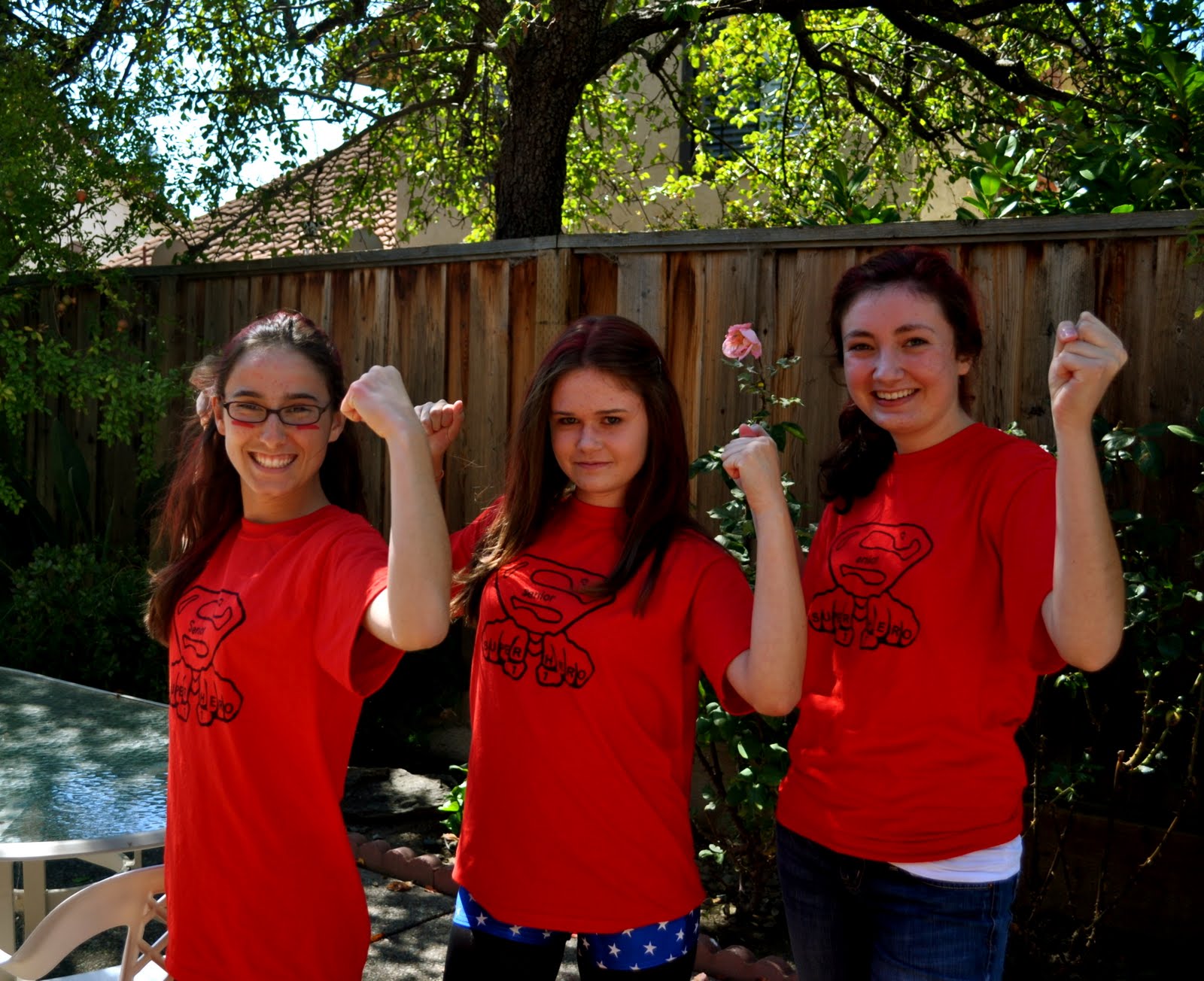
For all the Bowl-a-thon pictures, I choose to take them in color because the red in all the pictures represents all the seniors. I took a candid picture of the Student Body Officers to show their face paint and how they were dressed up as KISS. The second picture is a great one that shows our class spirit. I like that all the people in it take up most of the picture because it shows how many seniors are spirited. Even though the third picture is posed I like it because it shows unity since all three of them are posing the same. My favorite picture is the one of Kristen spraying Mackenzie’s hair. It’s a candid shot and the framing is nice because they balance the picture by not being in the same spot together. The smile on Kristen’s face shows how much fun they were having and allows the viewer to see how much they were enjoying getting ready for Bowl-a-thon. The last photo looks posed, but it was a candid. Jennifer was laughing at something someone said and I called her name, she turned around still smiling and I took the photo. I used the rule of thirds to frame her and I love the focus on this shot. She is in focus, but the background is blurry.




Rock Star Day

Rock Star Day was a day where everyone dressed up in band shirts, or leather jackets. I choose to shoot in color and black and white. I used black and white for the picture of Avery dressed up as Gene Simmons because her makeup and outfit was black and white and I didn’t want the background color to distract the viewer from the subject. I left Rachel’s picture in color because the blue from the lockers was a good contrast from her black jacket. I used the rule of thirds to frame her in this shot. I love the shot of Tanya because she is not looking at the camera and looks like she is posing for someone else. I left this picture is black and white to show the contrast between her and the background. I framed Tanya using the rule of thirds, but it is less noticeable because the shot was taken vertically. I did the same thing for Tina’s picture. I used the rule of thirds to shoot Tina too, but this photo makes it more noticeable. Lastly, I shot the volleyball game from that night in black and white. I used a 3200 ISO setting from my camera and that is why the photo looks grainier. I choose black and white for this action shot because then the emphasis is on the players than the surroundings.


Monday, September 20, 2010

Disney Day

These were some pictures I took during Disney Day. I used the color filter for them, except for the picture of my shadow with my Disney ears. For that photo I used a sepia filter. I took the picture of Chelby when she was posing for another picture, because I like that she isn't looking at my camera. It makes the photo less personal, but puts more emphasis on the wings she is holding up. The picture I took using the car mirror was really cool because it's a different point of view for the shot. The people looking at the photos are able to see my ears and Rebecca's ears. The picture of the pajama pants was an interesting shot because it was a different way to show the outfits worn for Disney day. I like the contrast of the red pants to the black converse. I love the picture of the shadow of my Mickey ears because I love the color in the picuture. I used a sepia filter on it to make the golden/brown color appear. I like that the ears are center-punched because it shows the emphasis in the photo. The picture of Rebecca and Tara is just one that makes me laugh because of their expressions. There is a nice contrast between colors because Tara is wearing bright colors and Rebecca is wearing dark colors. That allows the person viewing the photo to shift from one subject to the other because of the color change. The picture of Stefani is my favorite one with a subject because of her facial expression. She looked up right when I was taking the picture and wasn't expecting it. I used the rule of thirds to frame her, showing that she is the subject of the image. I like her facial expression too. It shows a sense of innocence because she didn't know I was going to take the picture. Her wide eyes remind me of Minnie Mouse and that was the character she was trying to mimick.


Tuesday, September 14, 2010

Group Photography

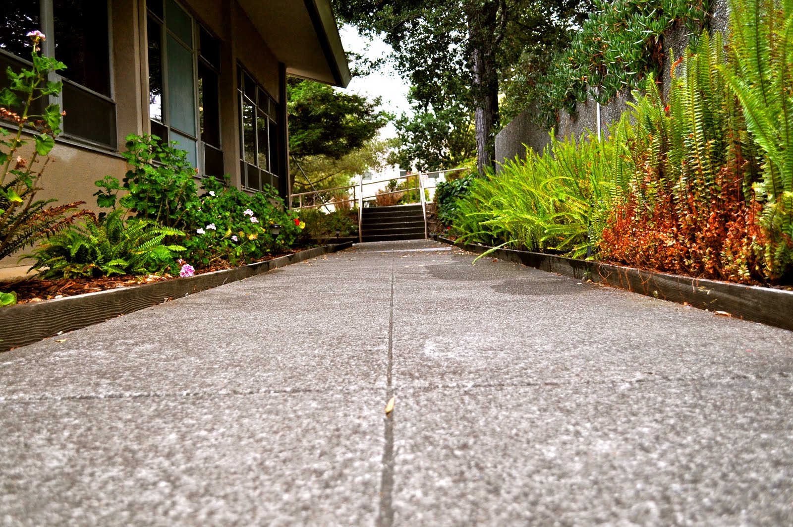
My group was assigned Russell Hall for our group photography. It was hard because we used the teacher's entrance to Russell and it was hard to get 3-5 great pictures from the location. The two photos below show different viewpoints from Russell's entrance. The first one follows the wall that is near the entrance. It forms a line and the person looking at the photo follows the wall with their eyes. I have unity and variety in the picture. There is variety because the flower, plants, and wall are all different colors, but there is unity too. The unity is seen in the green color in the photograph. There are plants in different places in the image and they all are unified because they have the same color. The second photo shows the walkway at the Russell entrance. It shows symmetrical balance and lines are formed from the image. The plants on both sides of the image help frame the pathway. I took the picture closer to the ground because I wanted the focus to be on the pathway and the photo at eye-level would show more background than I wanted. For both pictures I used filters to boost the color and for the first photo I added an antique filter to it to change the color hue a little.


Monday, September 13, 2010

Photojournalism- Margaret Bourke-White’s

Margaret Bourke-White’s photograph of Gandhi is framed in an interesting way. Gandhi is in one third of the frame but not the focus; the focus is on the pinwheel that is on the other side of the photo. The pinwheel is not in focus though, and Gandhi is. I first noticed the pinwheel because it is bigger, but then noticed that Gandhi was the one in focus. I like the usage of black and white in the photograph to show value because it shows the light and dark colors in the image. I think Gandhi is emphasized in the photograph because he is in focus. I feel sad looking at the picture because Gandhi looks sad while looking at a rag-doll. The usage of black and white helps to show Gandhi’s emotion and facial expression.

http://www.gallerym.com/work.cfm?ID=91

Photojournalism- Ed Kashi

I really enjoyed Ed Kashi’s photograph of a man making mud bricks in Madagascar. The viewer can’t see the man clearly because of the smoke surrounding him, and this adds some mystery to the photo. The man is framed using the rule of thirds. Lines are formed in the photo from the rows of the bricks the man has made. The bricks are surrounding him on all sides and my eyes started at the bricks closest to the camera and followed them up to the man. This photograph shows the working conditions in Madagascar and how they live their life. I like that Kashi used color for this picture because I see more unity in the colors of the bricks and stones. I am able to see the texture in the picture from the bricks that seem bigger because they are closer to the camera. I feel compassion for the man because it seems like he makes bricks everyday and that’s his job. That would be a hard life.

http://edkashi.com/